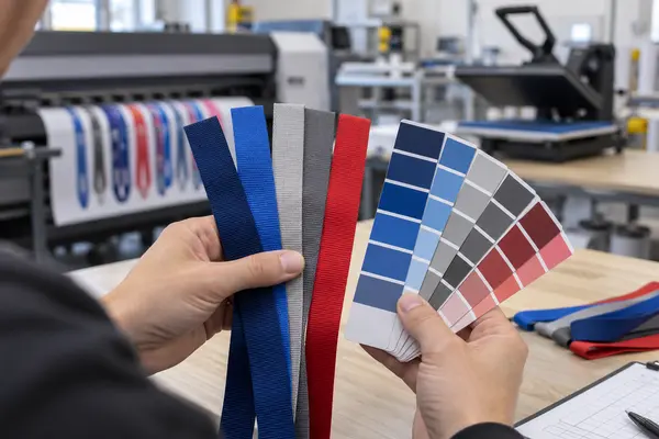
Short answer: dye sublimation lanyards can often match a Pantone reference very closely, but “exact” is not a responsible promise for every color. Sublimation uses process-color inks, heat and polyester fabric, while a Pantone swatch is a physical color standard produced under a different system. The achievable result depends on the color itself, artwork, printer, ink, transfer paper, webbing and heat-transfer settings.
In our production experience, most standard brand colors can be adjusted to approximately 98% visual similarity. A small number of difficult shades—especially certain blues, grays and colors near the edge of the printable gamut—may reach approximately 95% visual similarity after adjustment. These percentages describe practical visual similarity based on our factory experience; they are not a universal laboratory tolerance or a guaranteed Delta E value.
Can Dye Sublimation Lanyards Match Pantone Colors Exactly?
Not always. A Pantone number gives the buyer and manufacturer a shared target, but a dye sublimation printer does not place a premixed Pantone spot-color ink onto the lanyard. It builds the color from a process-color ink set, prints it onto transfer paper and then uses heat and pressure to transfer the dye into polyester fibers.
That conversion introduces several variables. Some Pantone colors sit comfortably inside the printer’s reproducible color range and can be matched very closely. Others cannot be reproduced exactly with the available ink, fabric and transfer conditions. This is why a professional supplier should describe the result as a close Pantone match or Pantone reference match—not promise perfect reproduction before testing the actual material.
For most event, promotional and corporate lanyard projects, a carefully adjusted visual match is sufficient. For a tightly controlled global brand program, the buyer should approve a physical pre-production sample and agree on a measurable tolerance before bulk production.
Why the Same Pantone Number Can Look Different on a Lanyard
A color is not determined by its Pantone code alone. The final appearance is the result of a complete production system.
1. Complex Artwork and Color Interaction
A single solid background is usually easier to control than artwork containing many colors, gradients, shadows, transparency or overlapping elements. In a complex design, every important brand color must be adjusted while surrounding colors can influence how it is perceived.
Small changes in adjacent colors may make the target color appear warmer, cooler, darker or less saturated. Fine text and narrow lines can also look different from a large solid color area even when they use the same digital value.
2. Printer and Transfer Paper
The printer must deliver ink consistently, but transfer paper also plays an important role. High-quality paper holds the printed image evenly and releases the dye efficiently during heat transfer. Inferior or unsuitable paper may reduce color density, create uneven transfer or make colors appear dull.
Color profiles must also correspond to the printer, ink, paper and final polyester webbing. A profile prepared for a different material is only a starting point, not a reliable production recipe.
3. Sublimation Ink Quality
Ink quality directly affects color gamut, saturation, stability and repeatability. Low-cost inks may produce muted colors, weak blacks or inconsistent output from one run to another.
Our production uses HP ink because it provides the color performance and consistency required for our workflow. However, the ink brand alone does not guarantee an accurate result. Printer condition, profiling, transfer settings and operator adjustment must work together.
4. Polyester Webbing Construction and Surface
For sublimation lanyards, the polyester webbing should have a dense, smooth and uniform surface. Loosely woven or rough webbing reflects light differently and provides a less even surface for fine details and solid colors. This can make a print look lighter, grainier or less saturated.
The base shade of the webbing matters too. Sublimation does not normally print an opaque white layer, so clean white polyester is the preferred base for accurate full-color reproduction. If the webbing itself has a warm, gray or uneven cast, the final color can shift.
5. Heat, Pressure and Transfer Time
Sublimation color develops during heat transfer. If temperature, pressure or dwell time changes, the final shade can change as well. Excessive heat can push some colors darker or alter their balance; insufficient heat can leave the result weak or uneven.
The operator must understand how the specific printer, ink, paper and webbing behave together. Machine settings cannot simply be copied from an unrelated job.
6. The Color Technician’s Experience
This is often the most important factor. Accurate color adjustment is skilled production work. An experienced technician prints a test, transfers it onto the actual lanyard webbing, compares the finished sample with the physical reference, corrects the color values and repeats the process when necessary.
Difficult colors may require several trials. The technician must know whether a mismatch comes from the artwork values, ink output, webbing, paper or heat-transfer settings. A factory with a developed color library and experienced operators can usually reach an approved result faster and reproduce it more consistently on repeat orders.
Which Colors Are More Difficult to Match?
Difficulty varies by production system, but buyers should allow additional testing for:
- Some deep, bright or highly saturated blues
- Neutral and cool grays, where a small shift may appear blue, green or warm
- Fluorescent and neon colors
- Metallic colors
- Very dark colors that require shadow detail
- Colors outside the printer and ink system’s reproducible gamut
- Designs with transparency, gradients or several overlapping colors
Fluorescent and metallic Pantone references should be discussed separately. Standard CMYK-based sublimation cannot reproduce the physical fluorescent glow or metallic reflection of special-effect inks. It can only create the nearest visual simulation available within its color range.
Screen Color, Printed Paper and Finished Lanyard Are Not the Same
| Reference | How Color Is Produced | Best Use |
|---|---|---|
| Computer or phone screen | RGB light emitted by a display | Artwork review, not final color approval |
| Pantone physical guide | Standardized physical color reference | Communicating the target color |
| Printed transfer paper | Sublimation ink before heat activation | Production control; color usually looks different before transfer |
| Finished polyester lanyard | Dye transferred into polyester under heat and pressure | Final approval standard |
Do not approve a critical brand color from a phone screenshot or the printed transfer paper. Pantone recommends using a current physical color standard when color quality must move from the digital world to a physical product. The finished lanyard sample, viewed beside that reference under controlled lighting, is the meaningful comparison.
Our Recommended Pantone Matching Workflow
- Provide the exact Pantone system and code. A number without the correct suffix or color system may be ambiguous. Also send a physical reference when color is critical.
- Identify the priority colors. Tell the supplier which logo or background colors are brand-critical and which secondary colors can use standard process conversion.
- Submit editable vector artwork. AI, EPS or print-ready PDF files reduce unnecessary conversion errors. Avoid relying only on a low-resolution JPEG or screenshot.
- Confirm the actual webbing. Color trials should use the same polyester webbing construction and surface intended for bulk production.
- Produce and transfer test strips. The technician should compare transferred fabric—not only paper output—with the physical reference.
- Approve a physical sample. For color-sensitive orders, approval should be based on a real sample before mass production.
- Keep production records. Approved artwork values, material, ink, paper and transfer settings should be retained for reorders.
- Compare repeat orders with the approved sample. If consistency is critical, keep a signed master sample and discuss an acceptable tolerance in advance.
What Buyers Should Include in an RFQ
To reduce sampling time and avoid preventable color disputes, include the following information when requesting a quotation:
- Editable artwork and logo files
- Exact Pantone code and color-system suffix
- Which colors are brand-critical
- Lanyard width, length and order quantity
- Single-sided or double-sided printing
- Required hooks, buckles, safety breakaways or badge holders
- Whether a physical pre-production sample is required
- Required delivery date and destination
- Any written color tolerance or approved master sample for repeat programs
If your artwork contains gradients, photographs, multiple sponsor logos or full-coverage color, see our custom heat transfer and dye sublimation lanyards. You can also review our lanyard materials, printing methods and customization options before preparing your RFQ.
Dye Sublimation or Screen Printing for Brand Colors?
| Requirement | Dye Sublimation | Screen Printing |
|---|---|---|
| Full-color artwork, photos and gradients | Excellent choice | Usually less practical |
| Many colors in one design | Efficient process-color reproduction | May require multiple screens |
| Simple one- or two-color logo | Suitable | Often a strong alternative |
| Pantone reference | Close simulation after adjustment | Spot-color ink can be mixed toward the target |
| Metallic or fluorescent effect | Not reproduced as a true special effect with standard CMYK sublimation | Special inks may be possible, subject to material and factory capability |
The better method depends on the artwork, quantity, material and color requirement. Dye sublimation is usually the better choice for detailed, multi-color and edge-to-edge designs. Screen printing may be worth evaluating for a simple logo with a small number of tightly controlled spot colors.
Frequently Asked Questions
Is a Pantone code enough for accurate sublimation color matching?
It is the correct starting point, but not always enough for final approval. Specify the Pantone system and suffix, and use a current physical Pantone reference or an approved physical product sample when the color is critical.
Why does the color on transfer paper look dull?
Sublimation ink develops after heat transfer. The paper print may look muted or different before it is transferred into polyester, so the paper should not be used as the final color standard.
Can you match a color from a logo screenshot?
We can use it as a visual reference, but a screenshot is not reliable for critical matching because displays vary and compressed files may alter color. An exact Pantone reference and editable artwork are preferable.
Should buyers approve a digital proof or a physical sample?
A digital proof is useful for checking layout, logo size, spelling and placement. A physical sample is the appropriate approval method for a critical finished color.
Will a repeat order have exactly the same color?
Production records and an approved master sample improve consistency, but minor lot-to-lot variation can still occur. Reorders should use the same artwork reference, material specification and approved color standard, with an agreed tolerance when required.
Can every color in multi-color artwork be adjusted separately?
Important colors can be adjusted individually, but changes may affect neighboring colors, gradients and overall balance. Identify the brand-critical colors before sampling so the technician can prioritize them.
Final Answer
Dye sublimation lanyards can match most Pantone references very closely, but no responsible manufacturer should promise an exact match for every shade without testing. The best results come from a controlled combination of accurate artwork, quality ink and transfer paper, dense smooth polyester webbing, stable heat-transfer settings and an experienced color technician.
For a color-sensitive project, send us your artwork, Pantone references, lanyard specifications, quantity and required accessories. We can review color achievability, recommend the appropriate printing method and arrange a physical sample before bulk production.
Editorial note: Pantone is a color-standard reference owned by Pantone LLC. Any percentages in this article describe LOVECOLOUR’s practical visual-matching experience and should not be interpreted as Pantone certification or a universal instrument-measured tolerance.