Trade shows, office corridors, campus events—people have only a few seconds to notice your brand. Most “forgettable” lanyards fail for one reason: the color choice isn’t built for distance, contrast, and real-world printing. This guide turns your brand colors into lanyards that stay visible, photograph well, and remain consistent in production.
Quick takeaway: Match color to brand personality, prioritize strong contrast for readability, and confirm visibility from a distance. Then align material + printing method + testing so the final lanyard looks the same in hand, in photos, and after daily wear.
Keep reading for a simple color-picking workflow, procurement checks, and ready-to-copy specs you can send to your supplier.
Why Color on Lanyards Is High ROI for Brand Memory
Lanyards disappear in a sea of badges when the color is dull, low-contrast, or too similar to common clothing tones. That means less exposure at events, fewer photo impressions, and weaker brand recall.
Bright, well-chosen colors create repeated impressions across trade show floors, staff photos, group shots, and daily wear. A low-cost item becomes a high-frequency branding tool when the color is chosen for visibility and consistency.
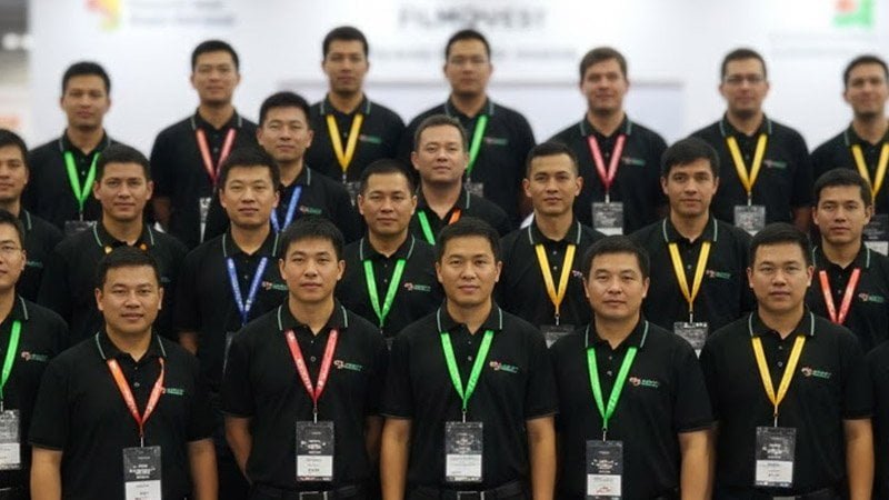
At a tech recruiting fair (800+ attendees), the original choice was a black lanyard with a dark gray logo—premium on screen, nearly invisible in real life. We revised it to a bold teal-leaning base with white high-contrast text, produced with dye-sublimation to keep the color saturated and edges crisp. The difference was immediate: in group photos and short videos, the brand color stayed recognizable from several meters away, staff were easier to locate, and the client reported noticeably more “Where did you get these?” conversations. Same budget—massively higher visibility.
How People Notice Color Fast: Distance, Photos, and Badges
At events, people scan in seconds. If your brand can’t be recognized instantly, your logo often won’t be read at all.
Color is processed almost instantly—typically before viewers read small text. With strong contrast, your lanyard stays visible across rooms, in photos, and on video calls.
In busy environments, viewers remember “that bright blue-green lanyard” before they remember the company name. That’s why lanyards work as micro-branding: the color becomes a shortcut to your brand in crowd scenes, hallway encounters, and camera moments. Your goal isn’t “the prettiest color”—it’s the most noticeable, readable, printable, and durable color combination.
Color Psychology Cheat Sheet for Custom Lanyards
You may know red feels energetic and blue feels trustworthy—but context determines whether that association helps or backfires.
Red can boost urgency, blue can signal reliability, green can reinforce eco values, and yellow grabs attention. But meaning shifts by culture, venue, audience age, and even lighting. Use a cheat sheet for direction—then test in your real setting.
Here’s a practical reference table you can use to narrow options quickly:
| Color | Common Perception | Best Use | Context Note |
|---|---|---|---|
| Red | Energy, urgency | Sales events, sports, promotions | Avoid for calm/clinical environments |
| Blue | Trust, calm | Finance, healthcare, corporate | Dark blue feels more formal |
| Green | Eco, growth | Sustainability, campus, NGO | Neon/lime feels playful but is more sensitive to printing |
| Yellow | Cheer, attention | Family events, guidance zones | Too much can strain eyes; pair with dark text |
| Purple | Premium, creativity | Art, premium gifting, VIP | Deeper shades feel more luxurious |
| Black | Power, minimal | Tech, formal events | Small text needs high contrast (white or bright ink) |
The 5-Step Lanyard Color Selection Process (From Brand Guide to Production)
Too many swatches leads to slow decisions, conflicting opinions, and costly re-sampling. A simple process keeps marketing, procurement, and production aligned.
Follow five steps: align to brand color, define the lanyard’s job, guarantee contrast, select the right print method, and test durability under real conditions.
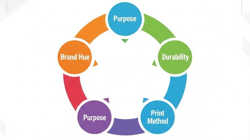
Use this workflow every time:
-
Brand Hue: Use your primary brand color—or a controlled complementary color for event editions.
-
Purpose: Is the lanyard for staff identification, VIP tiering, crowd flow, or maximum photo exposure?
-
Contrast: Validate logo/text readability under venue lighting and from distance.
-
Print Method: Choose dye-sublimation, screen print, or heat transfer based on the design and required accuracy.
-
Durability: Run rub, water/sweat, and UV/light exposure checks on samples before mass production.
A buyer-friendly checklist table:
| Step | Action | Procurement Checkpoint |
|---|---|---|
| Brand Hue | Choose primary/secondary or complementary | Confirm with brand guide or approved swatch |
| Purpose | Define event role | Document roles: staff/VIP/speaker/visitor |
| Contrast | Ensure readability at distance | Test under real lighting; adjust logo color if needed |
| Print Method | Match design to printing | Require sample made on the same material + method |
| Durability | Validate colorfastness | Agree pass/fail criteria for rub/wash/light exposure |
Winning Color Strategies for Events (Brand Recall + Crowd Management)
Using only one brand color misses opportunities to manage access, reduce confusion, and create buzz.
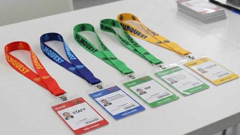
Four strategies consistently perform: signature dominance, VIP reverse, access coding, and event-edition colors. They improve recall and simplify on-site organization.
Use these tactics like a system:
-
Signature Dominance: Keep one strong base color consistent across events to build “instant recognition.”
-
Premium Reverse: Flip background/text colors for VIP tiers—fast to identify and feels exclusive.
-
Access Coding: Assign colors to staff/speakers/VIP/attendees to guide flow and improve safety.
-
Event Editions: Create yearly theme colors that become collectible and social-share friendly.
Production Considerations for Accurate Lanyard Colors (Material, Pantone, QC)
A great color choice can still fail if the material, printing method, and QC aren’t controlled. That’s where dull prints, color shifts, or fuzzy logos come from.
Material, printing process, color standards, and quality checks determine the final look. Lock specs early, test properly, and avoid surprises.
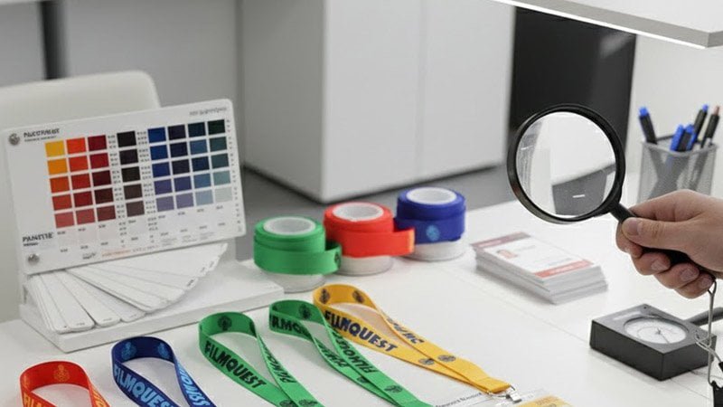
Key production factors buyers should confirm:
-
Material affects color output
-
Polyester: Excellent for dye-sublimation; vivid color and gradients.
-
Nylon: Can be better for certain screen-print effects; appearance differs from polyester.
Put the material in your spec—“same Pantone” can look different on different webbing.
-
Printing method determines edge clarity and color range
-
Dye-sublimation: Best for full coverage, gradients, photo-like detail, and high saturation.
-
Screen printing: Great for bold blocks and simple logos; cost-effective for limited colors.
-
Heat transfer: Can add special effects, but confirm durability and batch consistency.
-
Color standard and tolerance
Use Pantone (or an approved physical swatch) and define acceptance criteria:
-
acceptable color tolerance range,
-
consistency across reorders,
-
approval process for pre-production samples.
-
QC and testing expectations
At minimum, validate:
-
rub resistance (daily wear),
-
wash/sweat resistance (events + commuting),
-
lightfastness/UV exposure (outdoor use).
Request QC photos and check for: bleeding edges, uneven ink, misalignment, and inconsistent saturation.
Conclusion
The right lanyard color isn’t just “nice”—it’s a visibility system that improves brand recall, helps staff identification, and makes your logo show up clearly in photos. Use the process above to choose a high-contrast color combination, match it to the correct material and printing method, and validate durability before mass production.